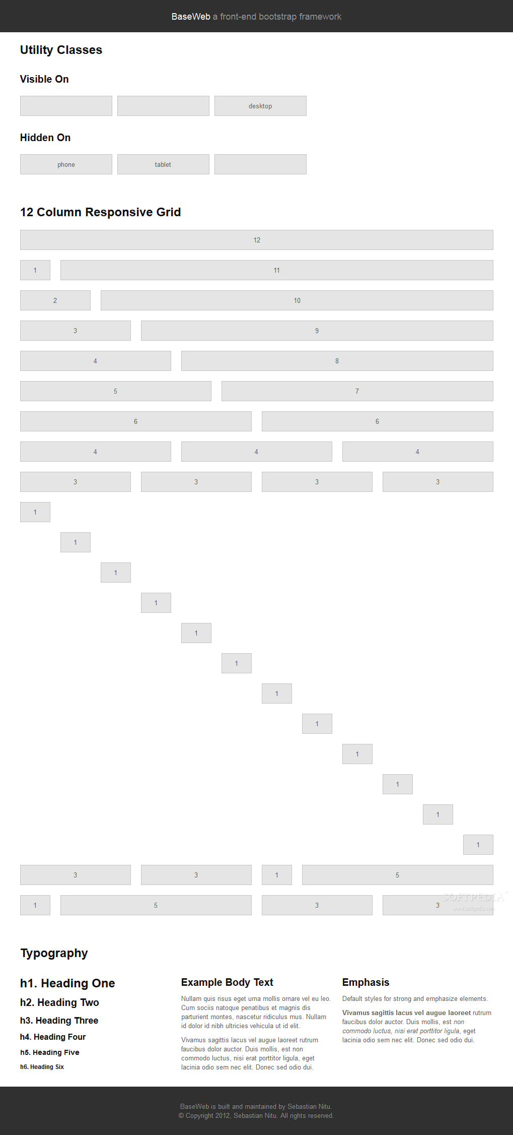
Compass is a stylesheet authoring framework that uses SASS to make stylesheets smaller and easier to write.
Susy brings the hype of responsive grids to Compass, allowing developers to create self-adjusting layouts, based on the user's viewport size.
Developers can control the total number of grid columns, the gutter's position in the grid, grid flow, and if it's a fixed or fluid grid.
Susy also comes complete with lots of media-query breakpoints so content can be divided among device types and screen width.
What is new in this release:
- Release npm susy package.
- Add global $susy-media map for creating named breakpoints.
- Add internal media-query support for susy-breakpoint without requiring the Breakpoint plugin.
- susy-breakpoint mixin no longer requires $layout argument. By default, no changes will be made to your existing layout.
- Update global-box-sizing and the legacy border-box-sizing mixins to optionally take another argument, $inherit. This new argument is a boolean value that defaults to false, meaning the behavior of these mixins will not change by default. The default behavior sets all elements to use the specified box-sizing, which can only be changed explicitly on a per-element basis. By passing in $inherit as true, the box-sizing is set on the html element, and all other elements inherit this property. This means that the box-sizing can be changed at the component level and all nested elements will inherit this change. This cascading effect can be prevented by explicitly setting box-sizing on the exceptions within the nested context.
- Add su import at root level.
What is new in version 2.2.5:
- Release npm susy package.
- Add global $susy-media map for creating named breakpoints.
- Add internal media-query support for susy-breakpoint without requiring the Breakpoint plugin.
- susy-breakpoint mixin no longer requires $layout argument. By default, no changes will be made to your existing layout.
- Update global-box-sizing and the legacy border-box-sizing mixins to optionally take another argument, $inherit. This new argument is a boolean value that defaults to false, meaning the behavior of these mixins will not change by default. The default behavior sets all elements to use the specified box-sizing, which can only be changed explicitly on a per-element basis. By passing in $inherit as true, the box-sizing is set on the html element, and all other elements inherit this property. This means that the box-sizing can be changed at the component level and all nested elements will inherit this change. This cascading effect can be prevented by explicitly setting box-sizing on the exceptions within the nested context.
- Add su import at root level.
What is new in version 2.2.3:
- Release npm susy package.
- Add global $susy-media map for creating named breakpoints.
- Add internal media-query support for susy-breakpoint without requiring the Breakpoint plugin.
- susy-breakpoint mixin no longer requires $layout argument. By default, no changes will be made to your existing layout.
- Update global-box-sizing and the legacy border-box-sizing mixins to optionally take another argument, $inherit. This new argument is a boolean value that defaults to false, meaning the behavior of these mixins will not change by default. The default behavior sets all elements to use the specified box-sizing, which can only be changed explicitly on a per-element basis. By passing in $inherit as true, the box-sizing is set on the html element, and all other elements inherit this property. This means that the box-sizing can be changed at the component level and all nested elements will inherit this change. This cascading effect can be prevented by explicitly setting box-sizing on the exceptions within the nested context.
- Add su import at root level.
What is new in version 2.2.2:
- Release npm susy package.
- Add global $susy-media map for creating named breakpoints.
- Add internal media-query support for susy-breakpoint without requiring the Breakpoint plugin.
- susy-breakpoint mixin no longer requires $layout argument. By default, no changes will be made to your existing layout.
- Update global-box-sizing and the legacy border-box-sizing mixins to optionally take another argument, $inherit. This new argument is a boolean value that defaults to false, meaning the behavior of these mixins will not change by default. The default behavior sets all elements to use the specified box-sizing, which can only be changed explicitly on a per-element basis. By passing in $inherit as true, the box-sizing is set on the html element, and all other elements inherit this property. This means that the box-sizing can be changed at the component level and all nested elements will inherit this change. This cascading effect can be prevented by explicitly setting box-sizing on the exceptions within the nested context.
- Add su import at root level.
What is new in version 2.0.0:
- ew susyone tests for split-columns, is-default-layout, medialayout, columns, relative-width, columns width and nth-of-type (using True).
- Sass 3.3.0.
- Rename local 2.0 variables that conflict with global susyone settings.
- Susyone container mixin applies full container settings at every breakpoint.
What is new in version 1.0.9:
- Fixed clearing with isolate-grid mixin.
What is new in version 1.0.7:
- Fixed edge-case where $container-style and $container-width cause conflict.
What is new in version 1.0.6:
- Added isolate and isolate-grid mixins.
- Added bleed mixin.
- Added $style argument to grid mixins.
- Fixed documentation typos.
What is new in version 1.0.5:
- Added support for rem-units.
- Cleaned-up quoted arguments.
What is new in version 1.0.4:
- Fixed bug in nested mixins that adjust support (e.g. nth-omeg inside at-breakpoint).
- Removed non-ie experimental support in at-breakpoint ie-fallback output.
What is new in version 1.0.3:
- Fixed Compass dependencies.
What is new in version 1.0.1:
- Fixed a bug in the relationship between $container-width and $border-box-sizing, so that grid-padding is subtracted from the width in certain cases.
- Reset right margin to auto rather than 0 with remove-omega.


評論沒有發現